Spark Drupal inline WYSIWYG initial accessibility observation
Spark Drupal is an initiative to improve the authoring experience in Drupal 7 / 8. Yesterday I spent several hours discussing the proposed improvements and am quite excited about the enhancements that the changes will make to the experience of newcomers to Drupal the product.
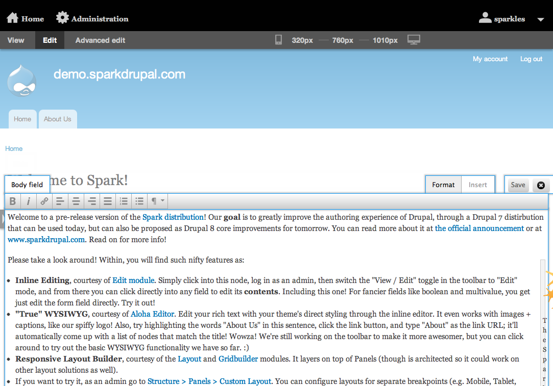
Some notes about the above inline edit WYSIWYG UI that will be discussed in more detail in my Drupalcon Munich session Accessibility of Custom User Interface Components using WAI-ARIA.
Anchors are not buttons
These are not buttons, using <button> or role="button" would change the semantics in the DOM / accessibility API respectively.
<a class="field-save save gray-button" href="#">Save</a>
<a class="field-close close gray-button" href="#"><span class="close"></span></a>
Tabbed toolbar
This is not a tablist nor are these tab buttons. See http://www.w3.org/TR/wai-aria/roles#tablist for the roles related to tabs. Hiding the unused tab does remove it from the Accessibility API so it is not accessible to assistive technology. This is good as UI / API should be in sync.
<div style="display: block; opacity: 1;" unselectable="on" class="drupal-aloha aloha-surface aloha-toolbar-tabs">
<ul unselectable="on" class="tab-handles aloha-drupal-ui-tab-handle-container">
<li class="aloha-drupal-ui-tab-handle aloha-drupal-ui-state-hidden">
<a aria-controls="aloha-drupal-ui-tab-panel-1" href="#aloha-drupal-ui-tab-panel-1">Captioned Image</a>
</li>
<li class="aloha-drupal-ui-tab-handle aloha-drupal-ui-state-default aloha-drupal-ui-state-active">
<a aria-controls="aloha-drupal-ui-tab-panel-2" href="#aloha-drupal-ui-tab-panel-2">Format</a>
</li>
<li class="aloha-drupal-ui-tab-handle aloha-drupal-ui-state-default">
<a aria-controls="aloha-drupal-ui-tab-panel-3" href="#aloha-drupal-ui-tab-panel-3">Insert</a>
</li>
These are buttons
Using the button element conveys proper semantics to the DOM and accessibility API.
<div class="aloha-drupal-ui-tab-panel aloha-drupal-ui-state-default" unselectable="on" id="aloha-drupal-ui-tab-panel-2">
<div unselectable="on" class="aloha-ui-component-group">
<span unselectable="on">
<button title="Bold" aria-disabled="false" role="button" class="ui-button ui-widget ui-state-default ui-corner-all ui-button-icon-only aloha-drupal-ui-state-hidden" type="button">
<span data-icon="" data-html-tag="bold" aria-hidden="true" class="ui-button-icon-primary spark-icon"></span>
<span class="ui-button-text">Bold</span>
</button>
</span>Contenteditable
It appears that the WYSIWYG uses contenteditable, which is not accessible to screen-readers (more testing required to determine if this is universally true). Tested with JAWS and Firefox latest releases. There is an interesting discussion of rich text editing in the Free-ARIA Google Group - Google Docs accessibility not quite there yet - Google Groups
<div id="edit-aloha-1345613888730" style="background-color: rgb(255, 255, 255); width: 1134px; position: relative; top: -5px; left: -5px; padding: 5px; margin-bottom: -10px;" class="field-item even edit-animate-fast edit-candidate edit-editable edit-highlighted edit-editing edit-wysiwyg-attached aloha-editable aloha-block-blocklevel-sortable ui-sortable aloha-editable-active" property="content:encoded" contenteditable="true">

<p>Welcome to a pre-release version of the <a href="http://drupal.org/project/spark" class="aloha-link-text">Spark distribution</a>! Our <strong>goal</strong> is to greatly improve the authoring experience of Drupal, through a Drupal 7 distirbution that can be used today, but can also be proposed as Drupal 8 core improvements for tomorrow. You can read more about it at <a href="http://buytaert.net/announcing-spark-authoring-improvements-for-drupal-7... official announcement</a> or at <a href="http://www.sparkdrupal.com/">www.sparkdrupal.com</a>. Read on for more info!</p>
Primary / Secondary tabs
When toggling from View to Edit mode, the (selected tab) faux semantic (text only) is not toggled. We used this faux semantic in Drupal 7 because
1. We did not want to invaldate markup using WAI-ARIA
2. The tablist/tab semantic is more geared to web applications
There has been recent discussion on the WebAIM mailing list about how to identify an active / selected item.
Interaction pattern / technical accessibility
Does it conform to WCAG, is it technically accessible, and can users understand and operate a UI are three different questions.
Using the tabs to select toolbars as an example:
1. It likely doesn't conform, as the selected state is note communicated with semantics
2. It is possible to toggle between tabs using a screen-reader (needs keyboard only testing)
3. It is not intuitive to understand that activating one of the links toggles something else on the page, and no notification of the result of the action is communicated.